
Amazon Web Services x BrainStation
Web redesign focused on improving searchability and user-friendliness


Project Overview
Problem: Amazon Data Exchange's current marketplace lacks searchability, user-friendliness, and clear dataset information, hindering organizations of all sizes from efficiently accessing and comparing datasets.
Solution: In 24 hours, my team — comprised of software engineers, data scientists, and project managers — and I improved the Amazon Data Exchange's marketplace with a clear search bar aligned with Amazon branding, an AI-generated 'For You' page offering personalized dataset recommendations, a user-friendly 2x2 card format for easier scan, and presented information in a digestible manner.
Project Type: Hackathon
|
Timeline: 24 Hours
Tools: Figma, Figjam, Canva
Role: UI/UX Designer & Researcher
Collaborators: Project Manager, Software Developers, Data Scientists
DESIGN PROCESS
DESIGN PROCESS
Given How Might We
The following question was given to us by AWS:
How might we build a more user-friendly approach to navigating the ADX marketplace so that users can more easily find useful datasets?
Getting Started
We began by addressing crucial steps before tackling the problem:
Understanding Amazon Data Exchange (ADX)
Defining roles and collaboration points for each discipline
Each discipline outlined their tasks with time limits. Within the 24 hour period, we had regular meetings that allowed us to regroup, assess progress, and discuss challenges.
Quantitative Research
With the help of the data scientists on the team, we gathered the following relevant secondary research:
| The global data marketplace platform is expected to grow at a compound annual growth rate of 25% from 2023 to 2030
| 32% of customers leave a brand they love after one bad experience
We also conducted a competitive analysis, examining similar competitors like Kaggle.
Name of Feature
Amount of Datasets
Amount of Users
Pricing
Home Page (UI Component)
Content (UI Component)
Amazon Web Services
3,500+
1.45M+
Free & Paid Options
Searchability Confusion
Irrelevant Information
Kaggle
283K
15M+
Free
Simple & Straightforward
Relevant Information
User Research Summary
Being that data scientists heavily use Amazon Data Exchange, we decided to prioritize this user group.
Due to time constraints, we opted not to seek external interviewees. Instead, our UX Designers interviewed data scientists within our team for insights into their goals and behaviors in navigating datasets. Additionally, we conducted usability tests with our team's data scientists, identifying specific areas for improvement. Here are the key areas we found:
Search bar
Content
Website aesthetic
Categorization of datasets
Revised How Might We
We revised the initial how might we question based on our chosen user group - data science tech professionals.
How might we build a more user-friendly approach to navigating the ADX marketplace for tech data professionals so that users can easily navigate preferred datasets?
Persona
From the insights gathered from the interviews and usability tests, I crafted my target user. Below, you'll find a snapshot detailing his pain points, behaviors, motivations, and a concise summary.

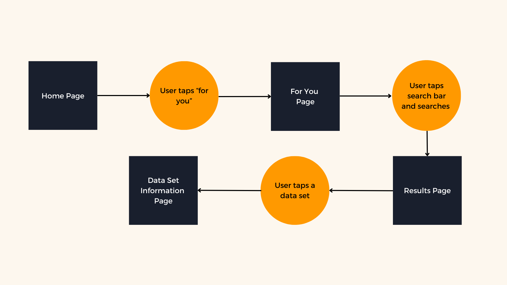
Task Flow
We narrowed our focus to a key task that our target user finds most important: navigating and locating the correct dataset. The task flow is shown below.
Hi-Fi Mockups
| Home Page
We refined the home page with a prominent, user-friendly search bar at the center, drawing inspiration from Kaggle.

Before
Users can’t directly search for what they are looking for

After
Clear search bar
| For You Page
We introduced a new feature called the 'For You' page, curated by artificial intelligence (AI) based on your past searches.

| Results Page
We refined the format of the results page so that users can easily scan each option with the relevant information.

Before
Data exchange is its own entity, shown in top left corner
Format that allows users to expand view for more information
Has relevant information for each dataset
Relevant filter options shown at top
Search button aligns with Amazon branding and capable of searching by categories

After
Data exchange is a filter
Overwhelming amount of content
Lacking relevant information under each dataset
Filter options are overwhelming
Search button is general and not cohesive with Amazon branding
| Dataset Information Page
We organized relevant information so that it is easily digestible for the user.

Before
The information of all sections is listed in one long page
Does not include the relevant and necessary information clearly at the top of the page

After
Each section has a dedicated tab
Includes the relevant and necessary information at the top of the page
Reflection
After the 24 hour hackathon, I felt extremely proud for what my team and I achieved. Together, we worked cross-functionally and created a user-friendly solution. Our success hinged on effective communication and strategic planning, involving regular meetings not only to discuss our progress but, more importantly, to check in on how each of us was doing.


